

Cover Art: My Most Perplexing Problem
Cover Art and Advertising
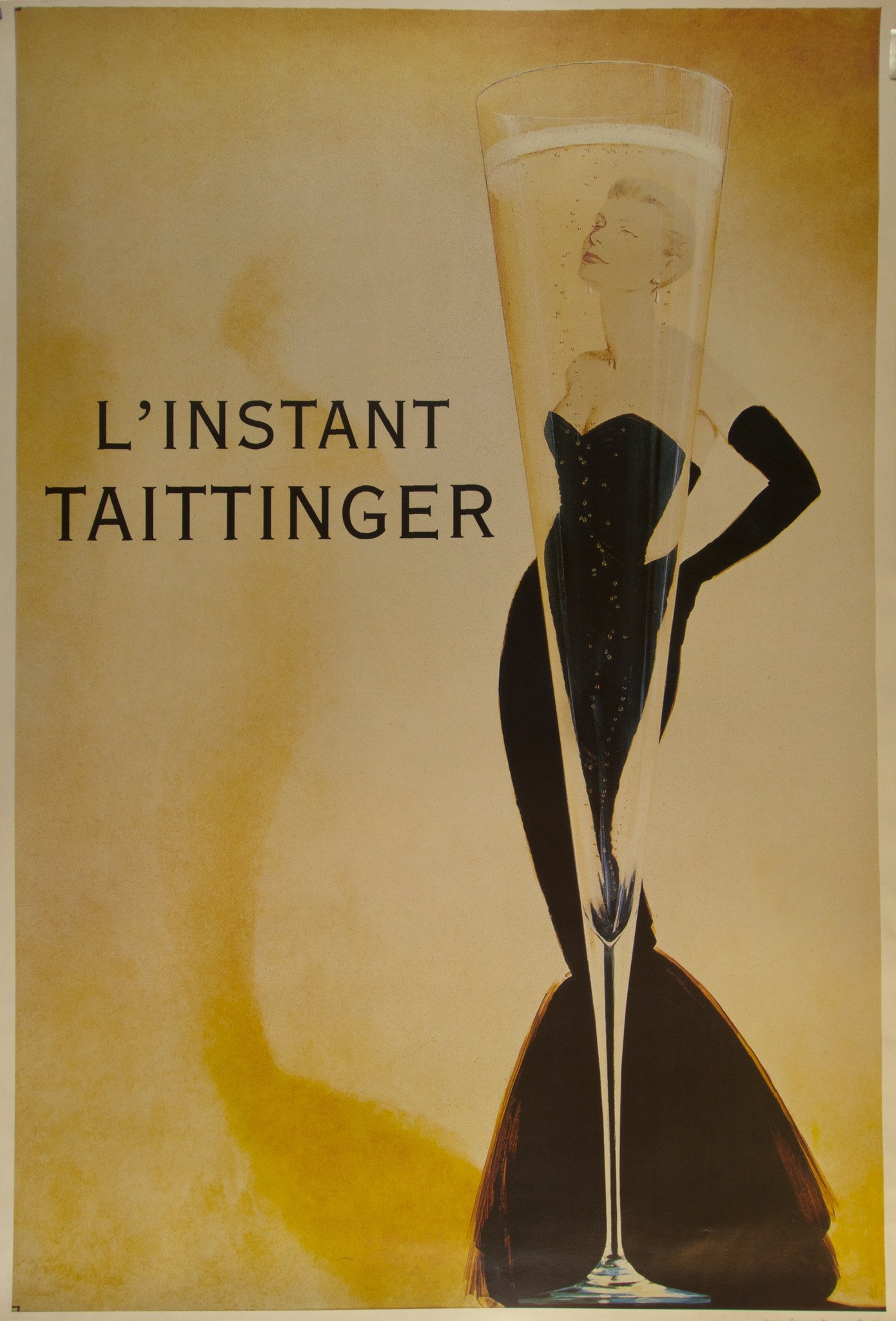
The title image is a famous ad for French champagne by Publicis Conseil. When I looked it up I was surprised to see that it was from 1989. I would have thought it was much older, like from the 1930s or 40s. So I guess its relative newness makes it an instant classic. Once you’ve seen it, you think it’s been around forever.
Cover art for a book, print advertising and movie posters all operate the same way. They are images meant to have emotional effects. And the emotional effects of the most powerful images skim just below the threshold of articulation.
No amount of words can capture the feeling you get looking at the L’Instant Taittainger ad. I can describe it all sorts of ways. It’s sleek, elegant, sexy, refined. But these adjectives aren’t emotional. The best I can say is that the image evokes elusive desirability (and whispers “It’s available for sale”). The overall point is: the image is doing work I cannot.
And that’s my perplexing problem. I work at and above the threshold of articulation. I can recognize a powerful image when I see it, but I can’t create one. There’s a reason I’m not a graphic designer.
Cover Art and Posters
Here’s a memorable Broadway playbill cover. You’ve all seen it, whether or not you’ve been to the musical by Andrew Lloyd Webber.

Playbill logo: Really Useful Group
Simple, arresting, mesmerizing in its way. You might not even realize you’re looking at a stylized face of a black cat with the word CATS serving as the nose. It makes you intrigued. Curious even, like a … well, you know.
Empire’s 50 Best Movie Posters Ever has this one at #4:

Poster artist: John Alvin
Later posters for Steven Spielberg‘s E.T. have the flying bike image. (Yes, you instantly imagined it.) But like Empire, I vote for this one with the Sistine Chapel reference. It sparks. Makes your heart go Ding!
By the way, the #1 movie poster is Jaws. I won’t show you the poster. I’ll simply remind you of the enormous shark with its open mouth lurking under the unwitting little swimmer on the surface. In a word: terrifying.
But I will show you the book cover for Jaws: A Novel by Peter Benchley.

Cover design: Tom Lenartowicz
You can hear it: The Jaws sound effect. Ominous. And, once again, terrifying.
Cover Art and Classic Romance Novels
Romance novel cover art is an industry unto itself.
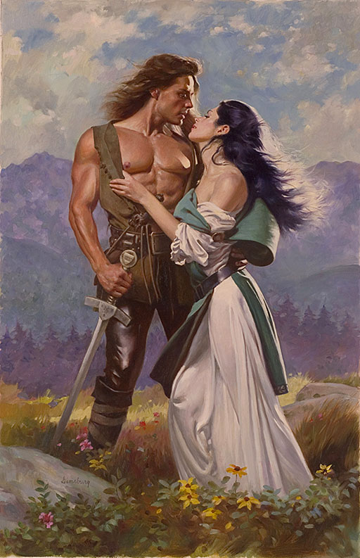
It used to be hunky Fabio who you wanted for the clinch.

Yup, there he is, waving hair and all. So what’s the emotion here? Tenderness, at least, but why is she looking away? Just to be clear, no scene like this occurs in the book.
Then came a time when romance novel book covers were a pretty bouquet.
But the clinch has never gone away, and current versions are done by cover artists such as Victor Gadino:
Cover art for Lady of Winter – going for breathless passion, I suppose. At least she’s looking at him
In recent years romance novel covers have had two developments, both clinch-less.
One. One of the main characters appears on the cover, often the heroine sumptuously dressed:

How to design a Duke is Book #9 in the Wardington Park Series by Eleanor Meyers
I interpret the intention of the image to be an inducement to desire. That of the reader wanting to slip into the woman’s skin and to experience the luxury and leisure of the heroine’s life for an afternoon.
Two. Ripped abs. Six-packs. Eight-packs.

I never argue with success. If Holly Hart makes the WSJ and USA Today lists, then she’s doing something right. And she’s going for it, making no pretense of subtlety.
I don’t think this image conveys an emotion. It’s making a demand.
Cover Art and Romance Novels: A New Trend
We come now to bookstagramming and the influence of social media. For your book you want a cover other people want to post on Instagram.
Although Crazy Rich Asians wouldn’t be classified exclusively as contemporary romance, the clean graphics of its covers are now shared by novels that do fall under that category.

The vivid crispness of these covers is more like the strikingly uncluttered examples of the posters and the Jaws: A Novel book cover I began this blog with.
Cover Art: Final Word
I’ve known forever and ever how important cover art is. But I don’t think I’ve come an inch closer to grokking what to put on mine.
I self-identify as a romance writer. But I don’t want a clinch, a ripped male torso, or other elements that read obviously romance-y. So, a contradiction.
Here’s a cover from one of my December 2018 releases created by CT Social. It’s a Georgian-era (18th century) romance with a central mystery involving a strange inheritance.

According to what I understand of the elements of good cover design, this cover works for several reasons.
First, it’s clean and graphic, single color with a strong contrast of light and dark.
Second, the font of the title is historically evocative.
Third, the atmosphere is (meant to be) intriguing and to inspire curiosity.
I like the cropped version of it used on various social media platforms and ads. You want to look over this man’s shoulder to get a glimpse of the conundrum he’s contemplating.

Inspired to read it? Try John Carter’s Conundrum.
For more advice on learning to write a novel, check out my complete guide.
Categorised in: Writing, Writing Tips
This post was written by Julie Tetel Andresen
You may also like these stories:


- google+
- comment